Amboss
Introducing a trusted exam companion as an everyday clinical tool.
Overview
When physicians think about AMBOSS, they often think about one thing: USMLE preparation.
This campaign set out to change that perception.
Designed for resident physicians already familiar with the platform, the objective was to introduce AMBOSS as a fast, reliable clinical knowledge companion, helping doctors access evidence based information, treatment guidance, and decision support tools while caring for patients. The challenge wasn't explaining what AMBOSS is. It was revealing everything users didn't realize it could already do.
The Challenge
Healthcare products communicate a lot of information. This project had less than 45 seconds to introduce multiple features, reposition the product, maintain readability on a mobile screen, and keep viewers engaged long enough to reach the final call-to-action. The biggest challenge wasn't the animation itself, it was deciding what not to show. Every second had to earn its place.

Creative Direction
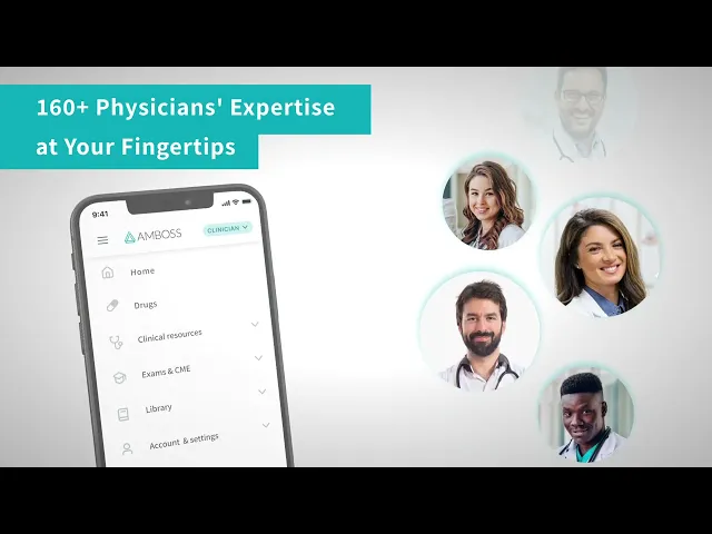
Rather than building the animation around abstract graphics or stock footage, I chose to make the product itself the visual centerpiece.
A fully animated 3D smartphone became the stage for the story, allowing the interface to remain authentic while creating movement and depth throughout the video. This approach served two purposes. First, it reinforced trust by presenting the real application instead of a stylized interpretation. Second, it allowed transitions to flow naturally from one feature to the next without distracting from the information physicians actually needed to absorb. To maintain clarity, UI animations were intentionally restrained. Motion supported the experience instead of competing with it, ensuring that each feature could be understood within seconds.


Design Principles
Keep the product authentic
The interface should always feel real. Rather than redesigning screens for visual impact, the animation presents AMBOSS as users will actually experience it.
Motion should guide, not distract
The animation moves quickly, but individual UI interactions remain simple. This balance allows viewers to process new information without feeling overwhelmed.
Every transition tells part of the story
The movement of the 3D phone isn't simply decorative, it mirrors the speed and fluidity of finding answers inside the app.
Simplify without losing meaning
The original brief introduced numerous features. Distilling them into a concise visual narrative ensured the core message remained clear: AMBOSS is much more than a question bank.
Reflection
Looking back, this project reinforced how much can be communicated through thoughtful motion rather than visual complexity. Working within a strict 40-second format meant every transition, every cut, and every animation needed a clear purpose. The experience reminded me that effective product motion isn't about adding movement, it's about helping people understand a product faster.